Software
Posters remain one of the most efficient ways to communicate a message in a physical space. Whether promoting an event, announcing a sale, or sharing key information in a school or office, a poster must capture attention instantly and communicate clearly at a glance.
For many first-time designers, the barrier is not the idea but the execution. Layout balance, typography, resolution, and print settings can feel technical. Poster design software reduces that friction by offering structured templates, visual guides, and simplified export options.
Tools in this category vary in interface complexity, template depth, stock asset access, and print configuration controls. Some prioritize speed and guided workflows; others offer more granular customization. Platforms such as Adobe Express provide a straightforward entry point for beginners through pre-sized templates and intuitive layout controls. If starting from a template-driven workflow, creating a printable poster with Adobe Express can simplify sizing and export decisions early in the process.
The guide below outlines a practical, repeatable workflow that works across most poster design software platforms.
Step-by-Step Guide to Using Poster Design Software
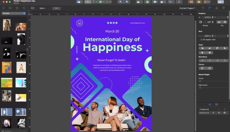
Step 1: Choose a print-ready template
Goal
Establish a balanced structure quickly without building a layout from scratch.
How to do it
- Open your poster design software and select a poster-sized template (e.g., 11×17, A3, 24×36).
- Filter by orientation (portrait or landscape).
- Choose a layout that matches the amount of content you plan to include.
- Replace placeholder text with your headline and key details.
- Keep the original structure intact during early edits.
What to watch for
- Overloading the template with extra text blocks.
- Selecting a design that visually conflicts with your theme.
- Ignoring built-in margin guides.
Tool notes
If you need to generate supporting headline ideas before designing, tools like Grammarly can help refine short, clear messaging prior to layout.
Step 2: Establish clear visual hierarchy
Goal
Make the main message readable within seconds.
How to do it
- Write a short, direct headline.
- Set the headline in the largest font size.
- Use a secondary size for date, time, or location details.
- Keep supporting information in smaller text.
- Limit yourself to two or three font styles.
What to watch for
- Using too many font families.
- Making all text the same size.
- Placing long paragraphs instead of short blocks.
Tool notes
For quick team collaboration on wording and approvals before finalizing layout, platforms such as Notion can centralize headline drafts and messaging decisions.
Step 3: Use high-resolution images and graphics
Goal
Prevent blurry or pixelated results in print.
How to do it
- Upload images that are at least 300 DPI at final print size.
- Use stock images provided within your software if you lack original assets.
- Resize proportionally to avoid distortion.
- Use simple shapes or overlays to improve text contrast.
- Keep decorative graphics secondary to the core message.
What to watch for
- Enlarging low-resolution images.
- Mixing inconsistent visual styles.
- Ignoring licensing terms for external assets.
Tool notes
If sourcing free, high-resolution images separately, platforms like Unsplash provide images that can be imported into your design software.
Step 4: Apply a focused color palette
Goal
Create contrast and clarity without visual clutter.
How to do it
- Select one primary color and one accent color.
- Ensure strong contrast between text and background.
- Maintain brand colors if applicable.
- Use color blocks to group related information.
- Zoom out to thumbnail size to test legibility.
What to watch for
- Extremely saturated colors that may print unevenly.
- Low-contrast combinations.
- Overuse of gradients.
Tool notes
For checking digital contrast accessibility before printing, tools like WebAIM offer contrast evaluation resources that can inform color choices.
Step 5: Configure print settings properly
Goal
Ensure accurate print size and edge finishing.
How to do it
- Confirm document size before exporting.
- Add bleed (commonly 0.125 inches) if the design extends to the edge.
- Keep text inside safe margins.
- Export as a high-quality print PDF.
- Confirm with your printer if CMYK conversion is required.
What to watch for
- Designing at the wrong dimensions and scaling later.
- Forgetting bleed for edge-to-edge color.
- Exporting compressed image files instead of print-ready PDFs.
Tool notes
When preparing files for commercial print vendors, platforms like FedEx Office publish detailed file specification guidelines that can help confirm resolution and bleed requirements.
Step 6: Proof and test before final printing
Goal
Catch visual and content errors before committing to bulk printing.
How to do it
- Review spelling, dates, and URLs carefully.
- Print a reduced-size proof copy on standard paper.
- Confirm spacing and alignment at 100% zoom.
- Ask another person to review key details.
- Double-check logos and brand consistency.
What to watch for
- Typos in headlines.
- Text too close to trim edges.
- Misaligned elements that appear centered but are not.
Tool notes
For tracking final revisions and approvals prior to sending files to print, project management tools such as Trello can help coordinate deadlines and sign-offs.
Step 7: Prepare a digital version for extended reach
Goal
Repurpose your poster for online promotion.
How to do it
- Export a web-sized version (e.g., 1080×1350 or 1080×1920).
- Adjust text size for smaller screens.
- Remove bleed and trim marks for digital use.
- Maintain consistent branding.
- Archive final print and digital files together.
What to watch for
- Using low-resolution exports online.
- Cropping important information in social media formats.
- Forgetting to adjust aspect ratios.
Tool notes
If scheduling social posts for your digital poster, tools like Buffer can help coordinate publishing across channels.
Common Workflow Variations
Photo-centered event poster
Start with a full-bleed image, then overlay headline text using high contrast. Keep supporting details minimal.
Minimal announcement poster
Use bold typography with limited graphics. Emphasize spacing and strong color contrast.
Multi-speaker or schedule poster
Use grid or column layouts. Keep spacing consistent and align text blocks carefully.
Recurring campaign template
Duplicate a master template and change only dates, headlines, or images to maintain visual consistency.
Checklists
Before You Start Checklist
- Confirm final poster size
- Prepare high-resolution images
- Finalize headline and key details
- Gather brand assets (logos, colors)
- Confirm printer requirements
- Identify deadlines
- Secure internal approvals
Pre-Export Checklist
- Correct document dimensions
- Bleed added (if required)
- Safe margins respected
- Images at 300 DPI
- Fonts consistent (2–3 max)
- Spelling and grammar reviewed
- Exported as print-ready PDF
- Proof copy reviewed
Common Issues and Fixes
Blurry print output
Use higher-resolution images or reduce image scaling.
Cut-off text
Adjust layout to keep important text within safe margins and include bleed.
Unexpected color shifts
Avoid extreme saturation and request a print proof when color accuracy is critical.
Cluttered layout
Remove non-essential text and increase spacing.
Imbalanced composition
Use alignment guides and grid tools to refine spacing.
How To Use Poster Design Software: FAQs
Is a template necessary for beginners?
Templates are generally faster and reduce layout errors. Blank canvases offer more flexibility but require stronger design judgment.
What file format is best for printing?
A high-resolution PDF designed for print is typically preferred.
How much text should a poster contain?
If the message cannot be understood within a few seconds, reduce the text. Posters are most effective when focused on a single clear purpose.
Can I reuse my poster design for social media?
Yes, but export separate digital dimensions to maintain readability across devices.